#filter'); -webkit-filter: blur(1rem); filter: blur(1rem) } .container { padding: 0 20px; max-width: 100%; margin: 0 auto } @media only screen and (min-width:36em) { .container { max-width: 540px; margin: 0 auto } } @media only screen and (min-width:48em) { .container { max-width: 720px; margin: 0 auto } } @media only screen and (min-width:62em) { .container { max-width: 960px; margin: 0 auto } } @media only screen and (min-width:75em) { .container { max-width: 1170px; margin: 0 auto } } .header { background-color: #fff; color: #343851; position: absolute; z-index: 4; width: 100%; top: 0; left: 0; will-change: transform; -webkit-transform: translateY(0); transform: translateY(0) } .header a { display: -webkit-box; display: -ms-flexbox; display: flex; -webkit-box-align: center; -ms-flex-align: center; align-items: center; border-bottom: 0 } .header__logo { display: -webkit-box; display: -ms-flexbox; display: flex; height: 100%; overflow: hidden; padding: 19px 0; margin-right: 1.25rem; outline: 0; border-bottom: 0; color: #313237 } .header__logo .header__logo--container { width: 58px } .header__logo .header__logo--container .logo { fill: currentColor } .header__inner { display: -webkit-box; display: -ms-flexbox; display: flex; -webkit-box-align: center; -ms-flex-align: center; align-items: center; height: 3.75em; -webkit-box-pack: justify; -ms-flex-pack: justify; justify-content: space-between } .header__links { padding-bottom: .5rem; display: none; position: absolute; top: 3.75em; left: 0; width: 100%; height: auto; background: #fff } .header__link { color: #343851; padding: .938rem 0; border-top: 1px solid #ededed } .header__toggle { display: -webkit-box; display: -ms-flexbox; display: flex; -webkit-box-orient: vertical; -webkit-box-direction: normal; -ms-flex-direction: column; flex-direction: column; -webkit-box-pack: center; -ms-flex-pack: center; justify-content: center; width: 44px; height: 100%; background-color: transparent; padding-left: 1.25rem } .header__toggle span { display: block; position: relative; margin-top: 4px; background-color: #343851; width: 100%; height: 2px; border-radius: 1px } .header__toggle span:first-child { margin-top: 0 } @media (min-width:62em) { .header__toggle { display: none; visibility: hidden } .header__links { position: static; padding: 0; display: -webkit-box; display: -ms-flexbox; display: flex; -webkit-box-orient: vertical; -webkit-box-direction: normal; -ms-flex-direction: column; flex-direction: column; visibility: visible; width: auto; height: 100% } .header__links-wrapper { display: -webkit-box; display: -ms-flexbox; display: flex; height: 100%; padding: 0 } .header__link { position: relative; padding: .938rem 1rem; border: 0; height: 100% } .header__link::after { content: ""; display: block; position: absolute; left: 0; bottom: 0; height: 3px; width: 100%; -webkit-transform: scaleX(0); transform: scaleX(0); background: #277cea } } .post-card { display: block; position: relative; width: 100%; min-height: 250px; border-radius: 4px; overflow: hidden; background-color: #fff; -webkit-box-shadow: 0 1px 3px rgba(0, 0, 0, .08); box-shadow: 0 1px 3px rgba(0, 0, 0, .08); margin-bottom: 2.25rem; border-bottom: 0 } @media only screen and (min-width:48em) { .post-card { width: 48.4375%; margin-right: 3.125% } .post-card:nth-child(2n+2) { margin-right: 0 } } @media only screen and (min-width:75em) { .post-card { width: 31.25%; margin-right: 3.125% } .post-card:nth-child(2n+2) { margin-right: 3.125% } } .post-card__label { position: absolute; top: 1.5rem; left: 1.5rem; z-index: 2 } .post-card__inner { display: block; position: relative; padding: 1.875rem 1.25rem .625rem; width: 100%; color: #838c8d; border-bottom: 0 } .post-card__header { margin-bottom: .75rem } .post-card__meta { font-size: .875rem } .post-card__thumb { margin: 0; background: #fff; position: relative; overflow: hidden } .post-card__thumb::after { content: ""; display: block; height: 0; width: 100%; padding-bottom: 56.25% } .post-card__thumb>* { position: absolute; top: 0; left: 0; width: 100%; height: 100%; display: block } .label { padding: 0 10px; margin-bottom: 1rem; display: inline-block; line-height: 20px; font-size: .75rem; text-transform: uppercase; letter-spacing: 1px; color: rgba(255, 255, 255, .8); border: 2px solid rgba(255, 255, 255, .5); border-radius: 100px } .hero { margin: 3.75rem auto 0; min-height: 16.25rem; width: 100%; position: relative; background-color: #dde5ea; background-repeat: no-repeat; background-position: 50%; background-size: cover } @media only screen and (min-width:62em) { .hero { margin: 0 auto; height: 36em } } .hero::before { position: absolute; display: block; content: ""; top: 0; left: 0; width: 100%; height: 100%; background: rgba(52, 56, 81, .8) } .hero__wrap { position: absolute; margin: auto; top: 50%; left: 50%; -webkit-transform: translate(-50%, -50%); transform: translate(-50%, -50%); text-align: center; color: rgba(255, 255, 255, .8); width: 100%; max-width: 90%; z-index: 1 } .hero__wrap .hero__title { font-size: 1.8em; color: #fff } .blog { background-color: #f9f9f9 } .post-list { padding-top: 2.5em; display: -webkit-box; display: -ms-flexbox; display: flex; -ms-flex-wrap: wrap; flex-wrap: wrap; -webkit-box-flex: 1; -ms-flex: 1 0 auto; flex: 1 0 auto } @media only screen and (min-width:48em) { .hero__wrap { max-width: 40em } .hero__wrap .hero__title { padding: 1rem 0; font-size: 2.625em; line-height: 3.125rem } .post-list { padding-top: 5em } }
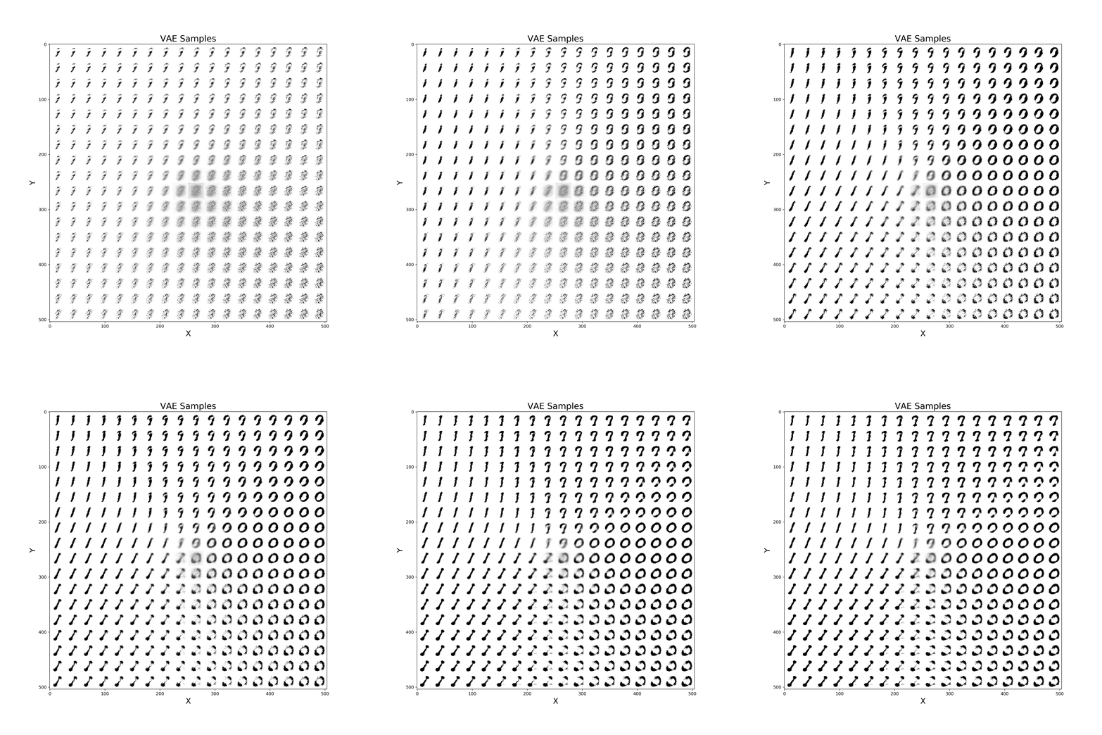
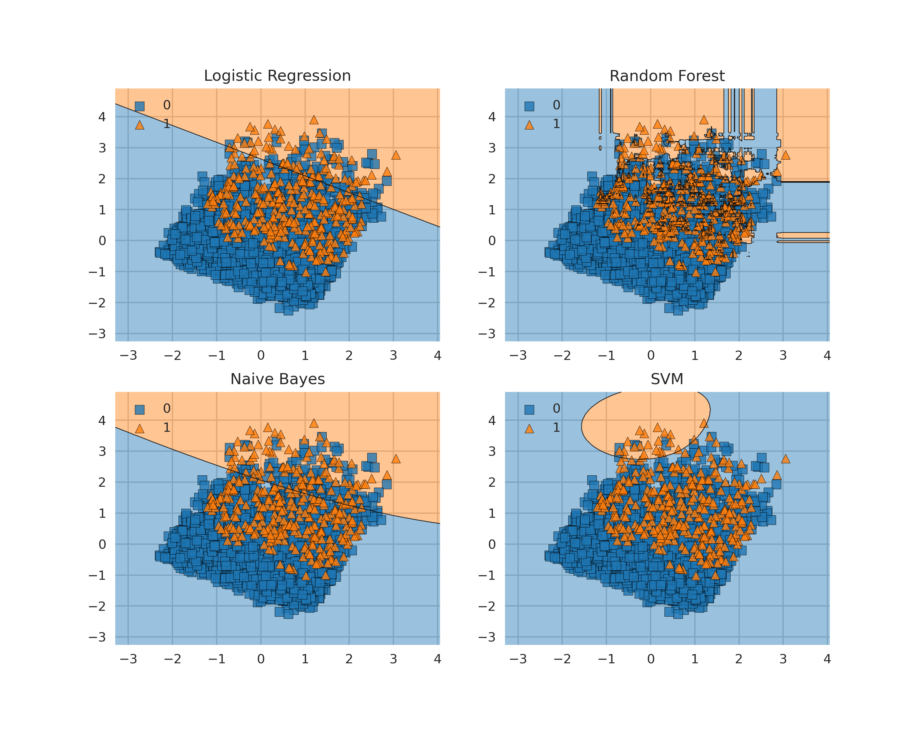
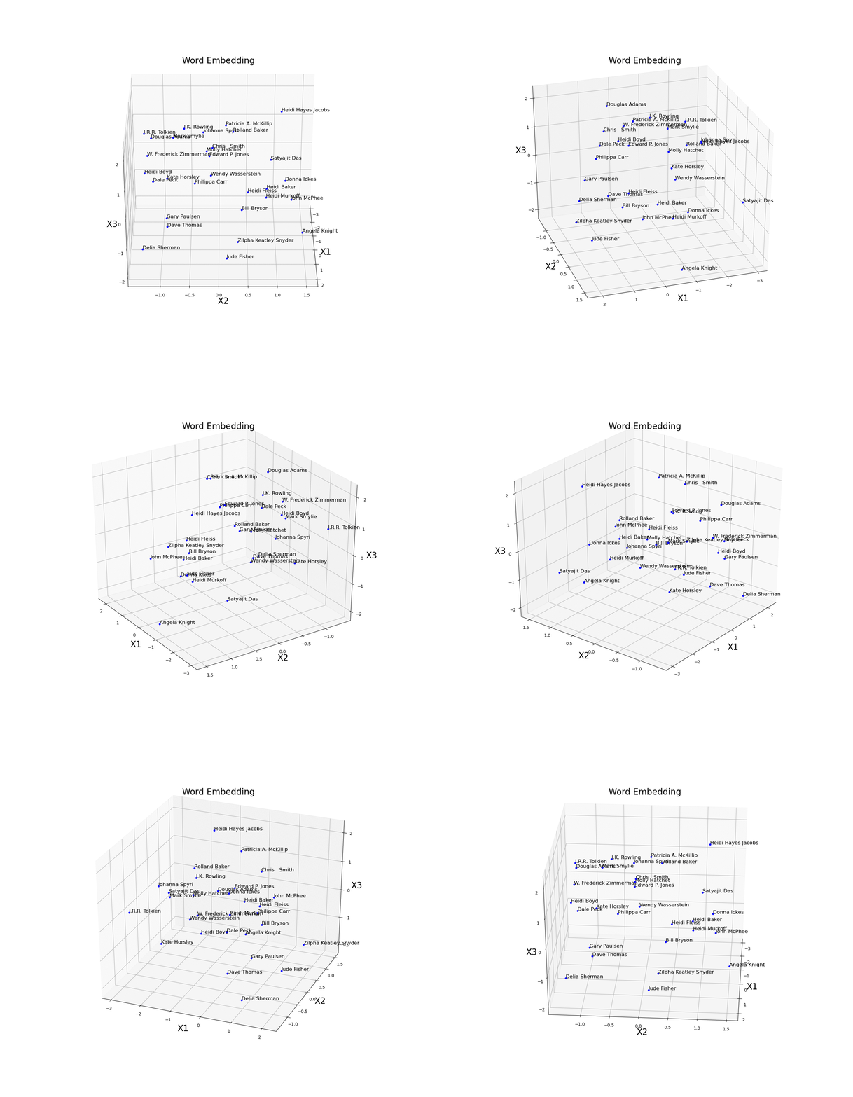
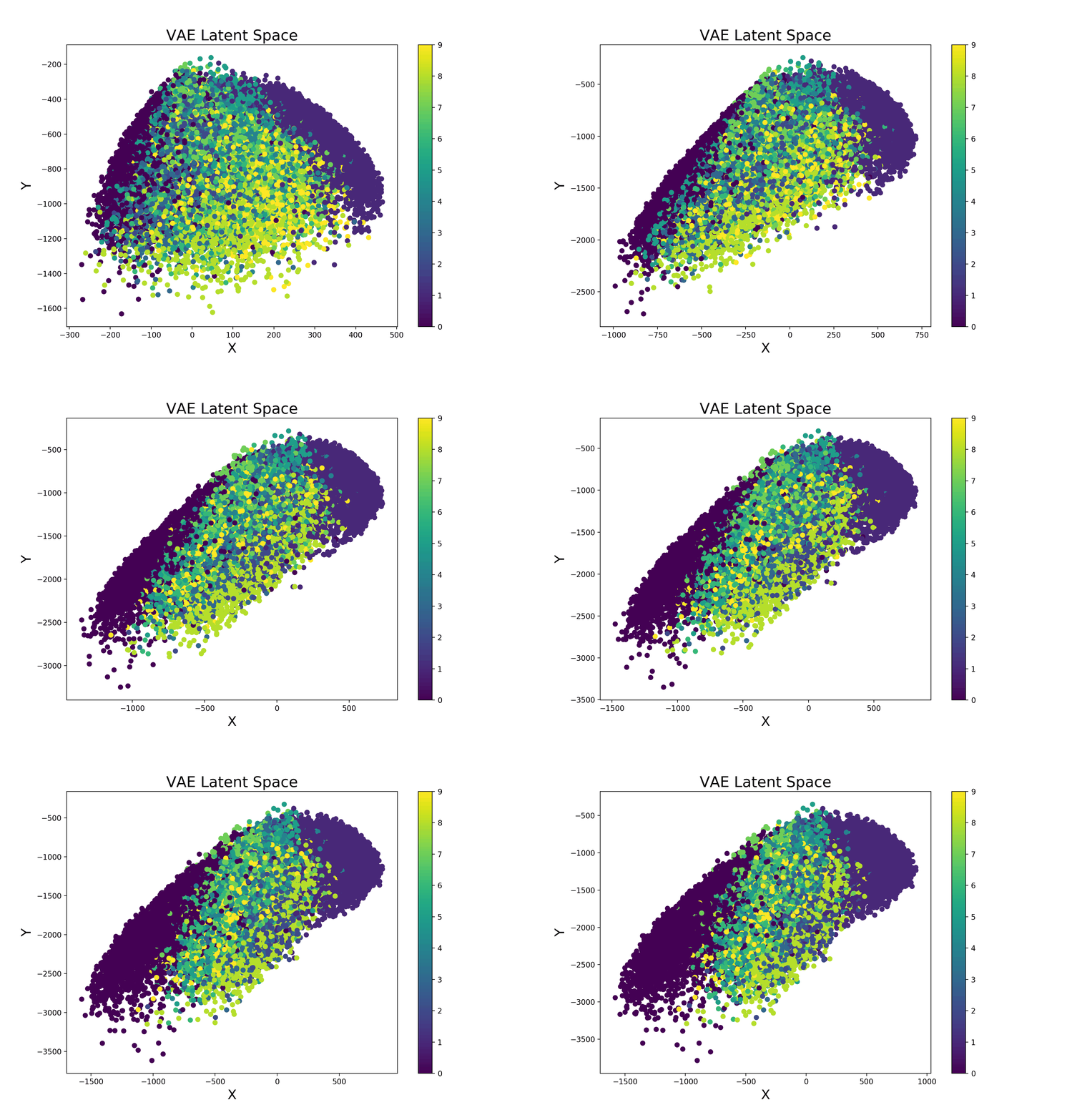
Examples of animations which can be created for Deep Learning models such as Variation Autoencoders and Word Embeddings.
Word Embeddings
Variational Autoencoder
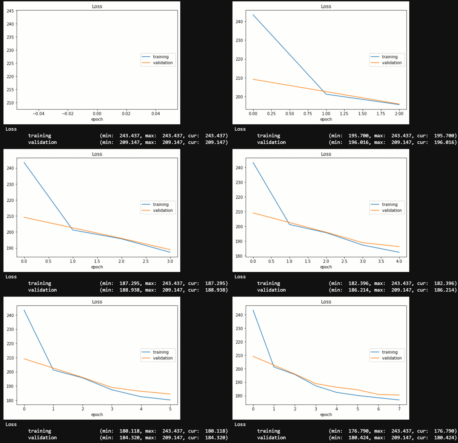
Live Loss tracker
Contacts If you want to keep updated with my latest articles and projects follow me on Medium and subscribe to my mailing list . These are some of my contacts details: